Frontend Styleguide#
This part of the documentation contains reference material for the frontend styleguide, including design principles, UI components, and best practices. It is intended to be followed in all kitconcept projects and add-ons.
Use TypeScript#
We use TypeScript for all new frontend code. Typings does not have to be perfect and crystal correct, but this alone, should be better than using plain JavaScript. This helps to catch errors early and improves code quality.
Add-on configuration#
Unified configuration structure#
We use a unified configuration folder structure for all kitconcept projects and add-ons.
Update it for existing projects if necessary.
We use src/index.ts for our add-ons (including project add-ons):
import type { ConfigType } from '@plone/registry';

const applyConfig = (config: ConfigType) => {
  // Apply the configuration

  return config;
};

export default applyConfig;
We will separate the configuration into multiple files given their purpose.
Create a src/config folder and add the necessary configuration files there.
For example, we can have the following files:
src/config/settings.tsfor add-on specific configurationsrc/config/blocks.tsfor blocks specific configurationsrc/config/slots.tsfor slots specific configurationsrc/config/widgets.tsfor widgets specific configuration
Then, from the src/index.ts file, we can import and apply the configuration from these files:
import type { ConfigType } from '@plone/registry';
import installSettings from './config/settings';
import installBlocks from './config/blocks';
import installSlots from './config/slots';
import installWidgets from './config/widgets';

const applyConfig = (config: ConfigType) => {
  installSettings(config);
  installBlocks(config);
  installSlots(config);
  installWidgets(config);

  return config;
};

export default applyConfig;
and for each configuration file, we can have something like this:
import type { ConfigType } from '@plone/registry';

const installBlocks = (config: ConfigType) => {
  // Install the blocks configuration

  return config;
};

export default installBlocks;
Do not use spread operator for configuration#
It is not needed, we are not in Redux world in here.
// ❌ Avoid this
config.blocks.blocksConfig = {
  ...config.blocks.blocksConfig,
  myBlock: {
    // block configuration
  },
};
Instead, directly assign the configuration:
// ✅ Do this instead
config.blocks.blocksConfig.myBlock = {
  // block configuration
};
Same for any other configuration, e.g. config.widgets, config.settings, etc.
No CSS imports as a side effect#
import './MyComponent.css'; // ❌ Avoid this
Instead, use VLT theme integration by adding src/theme/_main.scss and src/theme/_variables.scss files to your add-on.
Using Semantic UI theming or less as preprocessor is not permitted#
Period.
Add-ons and Volto Light Theme (VLT)#
Setting dependencies#
As a rule of thumb, add-ons should not depend on Volto or VLT.
Only in case that our add-on depends directly in code on VLT (eg. it imports widgets or components from it), it should be a peer dependency with a broader version range, e.g. ^7.
Add-ons will assume always VLT is present#
They will use the unified theme build and use VLT theme integration by adding src/theme/_main.scss and src/theme/_variables.scss files in your add-on.
In order for that to happen without making VLT a hard dependency, we will assume that VLT is always present in the project by following these steps.
While developing, install it in the dev environment as a workspace in the root mrs.developer.json:
{
  // other existing entries...
  "volto-light-theme": {
    "output": "packages",
    "develop": true,
    "package": "@kitconcept/volto-light-theme",
    "url": "git@github.com:kitconcept/volto-light-theme.git",
    "https": "https://github.com/kitconcept/volto-light-theme.git",
    "branch": "main"
  }
}
and declare it in the root package.json as a dependency:
{
  "dependencies": {
    // other existing dependencies...
    "@kitconcept/volto-light-theme": "workspace:*"
  }
}
Also add these overrides to the root package.json:
"pnpm": {
  "overrides": {
    // other overrides
    "@kitconcept/volto-light-theme": "workspace:*",
    "@kitconcept/volto-bm3-compat": "1.0.0-alpha.1"
  },
  // other pnpm packages
}
After that in the volto.config.js add @kitconcept/volto-light-theme to the addons and the thee like this:
const addons = ['volto-vlt-test-styleguide', '@kitconcept/volto-light-theme'];
const theme = '@kitconcept/volto-light-theme';
in the add-on's tsconfig.json, declare it as a path mapping:
{
  // other existing options...
  "compilerOptions": {
    // other existing options...
    "paths": {
      "@kitconcept/volto-light-theme/*": ["../volto-light-theme/frontend/packages/volto-light-theme/src/*"]
    }
  }
}
This way, you can develop your add-on while using VLT at the same time without making it a hard dependency.
In case it's a peer dependency of the add-on, add this override in the root package.json, so the dev build will use the workspace version:
{
  "pnpm": {
    "overrides": {
      "@pmmmwh/react-refresh-webpack-plugin": "^0.5.15",
      "react-refresh": "^0.14.2",
      // other existing overrides...
      "@kitconcept/volto-light-theme": "workspace:*",
    }
  },
}
Use VLT components and widgets#
Important
It is forbidden to use Semantic UI React components.
It is only allowed in existing shadows where we still have to migrate to use @plone/components or React Aria Components.
Whenever possible, use existing components and widgets from VLT.
If you need a new component or widget, consider contributing it to VLT first.
This helps to keep a consistent look and feel across all kitconcept projects and reduces the amount of duplicated code.
We should use @plone/components and React Aria Components whenever possible.
Always use the Image component#
When rendering images, always use the Image component from @plone/volto.
This ensures that images are rendered correctly and consistently across all kitconcept projects.
Whenever possible, use the sizes props to provide responsive images with the proper configuration depending on the image usage.
Add blockSchema to all blocks#
It is important to add blockSchema to all blocks, since it powers the default values for the block's settings form.
{
  teaser: {
    id: 'teaser',
    title: 'Teaser',
    icon: imagesSVG,
    group: 'common',
    view: TeaserViewBlock,
    edit: TeaserEditBlock,
    restricted: false,
    mostUsed: true,
    sidebarTab: 1,
    blockSchema: TeaserSchema,
    dataAdapter: TeaserBlockDataAdapter,
    variations: [
      {
        id: 'default',
        isDefault: true,
        title: 'Default',
        template: TeaserBlockDefaultBody,
      },
    ],
  },
}
Use it in also in the "Data" components of your blocks, avoid retrieving it as a module import, as shown:
// ❌ Avoid this
import { MyBlockSchema } from './schema';
const MyBlockData = (props) => {
  const { data } = props;
  const schema = MyBlockSchema({ ...props, intl }); // Avoid this

  return (
    <BlockDataForm
      schema={schema}
      title={schema.title}
      onChangeField={(id, value) => {
        dataAdapter({
          block,
          data,
          id,
          onChangeBlock,
          value,
        });
      }}
      onChangeBlock={onChangeBlock}
      formData={data}
      block={block}
      blocksConfig={blocksConfig}
      navRoot={navRoot}
      contentType={contentType}
      errors={blocksErrors}
    />
  );
};
Instead, retrieve it from the block's props:
// ✅ Do this instead
const MyBlockData = (props) => {
  const { data, blocksConfig } = props;

  const schema = blocksConfig.myBlock.blockSchema({ ...props, intl }); // Do this

  return (
    <BlockDataForm
      schema={schema}
      title={schema.title}
      onChangeField={(id, value) => {
        dataAdapter({
          block,
          data,
          id,
          onChangeBlock,
          value,
        });
      }}
      onChangeBlock={onChangeBlock}
      formData={data}
      block={block}
      blocksConfig={blocksConfig}
      navRoot={navRoot}
      contentType={contentType}
      errors={blocksErrors}
    />
  );
};
The right way to instantiate BlockDataForm#
This is the right way of instantiating the BlockDataForm component from @plone/volto/components/manage/Blocks/BlockDataForm:
import { BlockDataForm } from '@plone/volto/components/manage/Blocks/BlockDataForm';

const MyBlockData = (props) => {
  const { data, blocksConfig } = props;

  const schema = blocksConfig.myBlock.blockSchema({ ...props, intl });

  return (
    <BlockDataForm
      schema={schema}
      title={schema.title}
      onChangeField={(id, value) => {
        dataAdapter({
          block,
          data,
          id,
          onChangeBlock,
          value,
        });
      }}
      onChangeBlock={onChangeBlock}
      formData={data}
      block={block}
      blocksConfig={blocksConfig}
      navRoot={navRoot}
      contentType={contentType}
      errors={blocksErrors}
    />
  );
};
Use of the blocks StyleWrapper#
Our blocks settings and blocks widgets should always leverage the usage of the blocks StyleWrapper.
This ensures that the blocks are styled correctly and consistently across all kitconcept projects.
The StyleWrapper is embedded in the blocks engine and it is used to wrap the block content.
We should always use it with the injection of custom CSS properties that we want to apply to the block. If we want to inject a single property (and it seems that won't change in the foreseeable future), we will use the property directly. See example in: https://6.docs.plone.org/volto/blocks/block-style-wrapper.html#custom-css-properties-recommended
If we want to inject multiple properties, we should use the :noprefix suffix for the styles properties that we want to be applied directly to the block, without any prefix.
This is useful for properties that are not specific to any namespace, but are more general, e.g. blockWidth, alignment, etc. See below and in https://6.docs.plone.org/volto/blocks/block-style-wrapper.html#avoid-injecting-nested-prefixes for more details.
There are some handlers that we would like always to use and define them the same way:
See the official documentation for more details: https://6.docs.plone.org/volto/blocks/block-style-wrapper.html
Block width#

Block Width Example#
import { addStyling } from '@plone/volto/helpers/Extensions/withBlockSchemaEnhancer';

export const MyBlockSchema = ({ schema, formData, intl }) => {
  // More custom schema code...

  addStyling({ schema, intl });

  schema.properties.styles.schema.fieldsets[0].fields = [
    'blockWidth:noprefix',
    ...schema.properties.styles.schema.fieldsets[0].fields,
  ];

    schema.properties.styles.schema.properties['blockWidth:noprefix'] = {
    widget: 'blockWidth',
    title: intl.formatMessage(messages.BlockWidth),
    default: 'default',
    filterActions: ['narrow', 'default'], // The actions that we are supporting in the block
  };
}
Alignment#
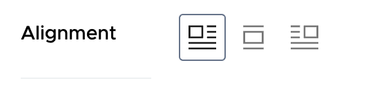
Block Alignment Example#
import { addStyling } from '@plone/volto/helpers/Extensions/withBlockSchemaEnhancer';

export const MyBlockSchema = ({ schema, formData, intl }) => {
  // More custom schema code...

  addStyling({ schema, intl });

  schema.properties.styles.schema.fieldsets[0].fields = [
    'align:noprefix',
    ...schema.properties.styles.schema.fieldsets[0].fields,
  ];

  schema.properties.styles.schema.properties['align:noprefix'] = {
    widget: 'blockAlignment',
    title: intl.formatMessage(messages.Alignment),
    default: 'left',
  };
}
Never place full components inside other components#
Avoid placing a full component implementation inside a component implementation, as this can lead to performance issues and makes the code harder to read and maintain.
// ❌ Avoid this
const MyComponent = (props) => {
  const { someProp } = props;
  const AnotherComponent = (props) => {
    const { anotherProp } = props;

    return <div>{anotherProp}</div>;
  };
  return (
    <div>
      <AnotherComponent anotherProp={someProp} />
    </div>
  );
};
Instead, define the component outside and use it inside the other component:
// ✅ Do this instead
const AnotherComponent = (props) => {
  const { anotherProp } = props;
  return <div>{anotherProp}</div>;
};
const MyComponent = (props) => {
  const { someProp } = props;
  return (
    <div>
      <AnotherComponent anotherProp={someProp} />
    </div>
  );
};